 Published: 19 Jun
2025
Published: 19 Jun
2025 5-min read


Table of Contents
INTRODUCTION
The basic Goal of CSS is to define characteristics of an elements so the browser engine can paint it on webpage. The most basic building block in CSS is called Decleration. A CSS property and value pair forms an Decleration(name:value). It is used to set an property to specific value.
In CSS, rules are written as name:value pair. The value of any parameters needs to be expressed in an particular type of unit. There are numerous types of Units available in CSS. Broadly these units can be categorised into two types in CSS.
- Absolute Units
- Relative Units
There are hundereds of different properties in CSS and numerous types of value systems. Each property define its own set of valid values. Not all values are accepted by any property. CSS provides multiple ways to define values.
In all the CSS units there is no space between the unit and number. So the correct way of specifying a property value is "20px" and not "20 px".
Absolute Units
Absolute units are standard units which we use in our daily life. The size of these units is fixed and does not change with screen size. These units are more useful when used for printed documents rather than screen. The Absolute Units available is CSS is listed below.
- Centimeter - cm
- Millimeter - mm
- Quarter-millimeter - Q
- Inches - in
- Picas - pc
- Points - pt
- Pixels - px
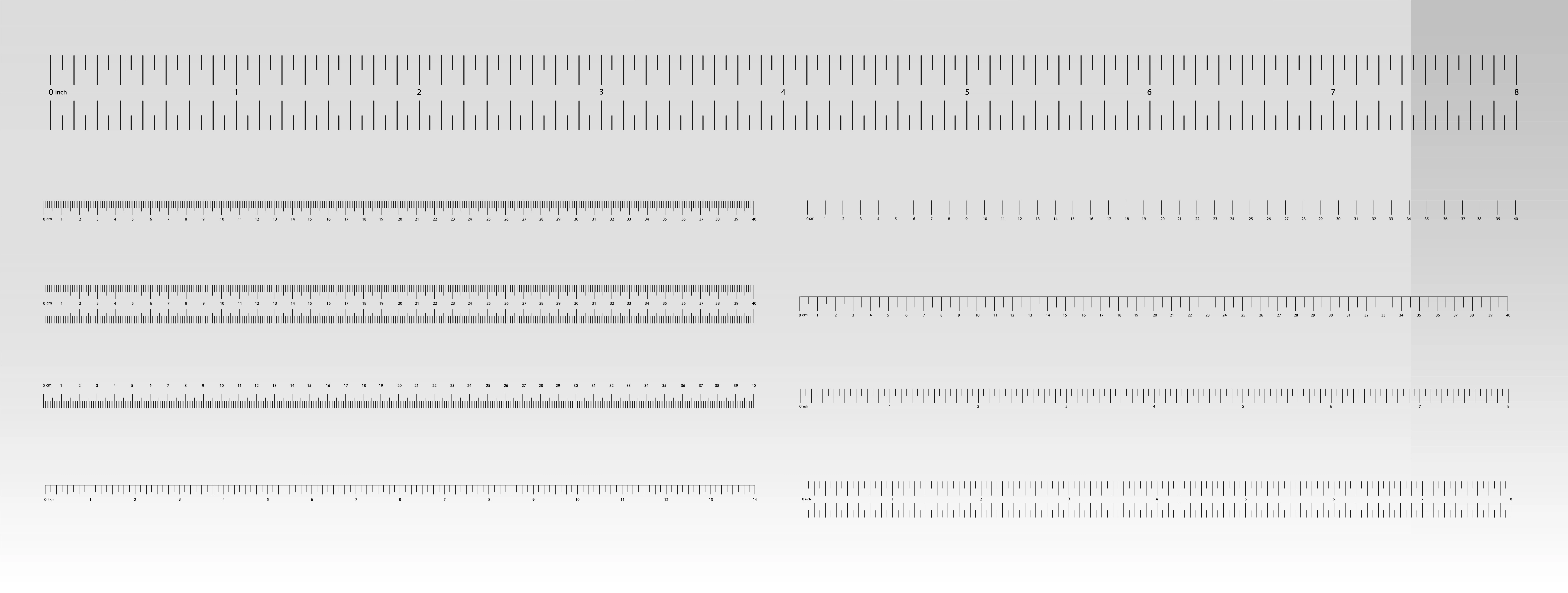
1. Centimeter - cm
Centimeter is represented as cm. The value of 1 Centimeter is nearly equal to 37.8 pixel or 0.394inch.
2. Millimeter - mm
Millimeter is represented as mm. The value of 1 Centimeter is nearly equal to 3.78 pixel or 1/10th of centimeter.
3. Quarter-millimeter - Q
Quarter-millimeter is represented as Q. The value of 1 Quarter-millimeter is nearly equal to 1/40th of centimeter.
4. Inches - in
Inches is represented as in. The value of 1 Inches is nearly equal to 2.54 centimeter or 96 Pixel.
5. Picas - pc
Picas is represented as pc. It is an unit used in typography. It was generally used in newspapers and magzines. The value of 1 Picas is nearly equal to 1/6th of 1 inch.
6. Points - pt
Points is represented as pt. It is an unit used in typography. It is generally used by printers or word processing softwares. Traditionally value of 1 point is nearly equal to 1/72th of 1 Inch.
7. Pixel - px
Pixel is represented as px. Pixel is the most widely used length unit. Traditionally monitors had an resolution of 1024 X 768 and with an DPI(Dots per Inch) of 96. Hence 1 pixel was considered equal to 1/96th of inch. But monitors now have higher DPI, hence 1 pixel is generally not equal to 1/96th of inch. So the size of 1 pixel vary with device.
| Unit | Name | Equivalent To | Description |
|---|---|---|---|
| px | Pixel | 1px = 1/96in | Screen-based fixed unit. |
| in | Inch | 1in = 2.54cm | Physical inch. |
| cm | Centimeter | 1cm = 10mm | Physical centimeter. |
| mm | Millimeter | 1mm = 10Q | Physical millimeter. |
| Q | Quarter-millimeter | 1Q = 0.25mm = 1/40cm | Used in Japanese typesetting for fine print control. |
| pt | Point | 1pt = 1/72in | Standard unit in typography. |
| pc | Pica | 1pc = 12pt = 1/6in | Used in publishing and layout. |
Relative Units
The value of Relative units depends on something else. Generally they are calculated relative to parent element font or viewport (visible area of screen) size. The main advantage of using Relative units is that their size gets adapted to various screen sizes. The Relative units available is CSS is listed below.
- Percentage
- rem
- ex
- ch
- lh
- rlh
- em
1. The Percentage % Unit
The Percentage % unit is is a relative unit in CSS that expresses a value as a fraction of another value — usually the value of a parent element or containing block, depending on the CSS property. This unit can be used with various properties such as width, height, margin, padding, and font-size.
Example:
<div>
  <div>Width: 50%</div>
  <div>Width: 30%</div>
</div>
Let us see the Behavior of various propeties when percentage is used by Property Type.
| CSS Property |
Percentage is Relative To |
|---|---|
| width, min-width, max-width |
Width of the parent element |
| height, min-height, max-height |
Height of the parent element (only works if parent has defined height) |
| margin, padding |
Width of the parent (even for top/bottom) |
| font-size | Font size of the parent element |
| translate, top, left (positioning) |
Size of the containing block |
2. The em Unit
In CSS em unit refers to font-size of the current HTML element it is used for. If the font-size of an element is 12px then 1em is equal to 12px for that element. Hence the value changes from element to element.
When em is used for font-size property it is relative to font size of parent element. Because of this em unit often gets compounded with subsequent childrens.
Example: Consider You have 3 divs, where Ist div is parent of 2nd div and 2nd div parent of 3rd. If font-size of 1st, 2nd and 3rd div is set to 20px, 1.5em, 1.5em respectively. So the font-size of 2nd div becomes 20 x 1.5 = 30px and font-size of 3rd div becomes 30 x 1.5 = 45px. So you have to be carefull while using em unit.
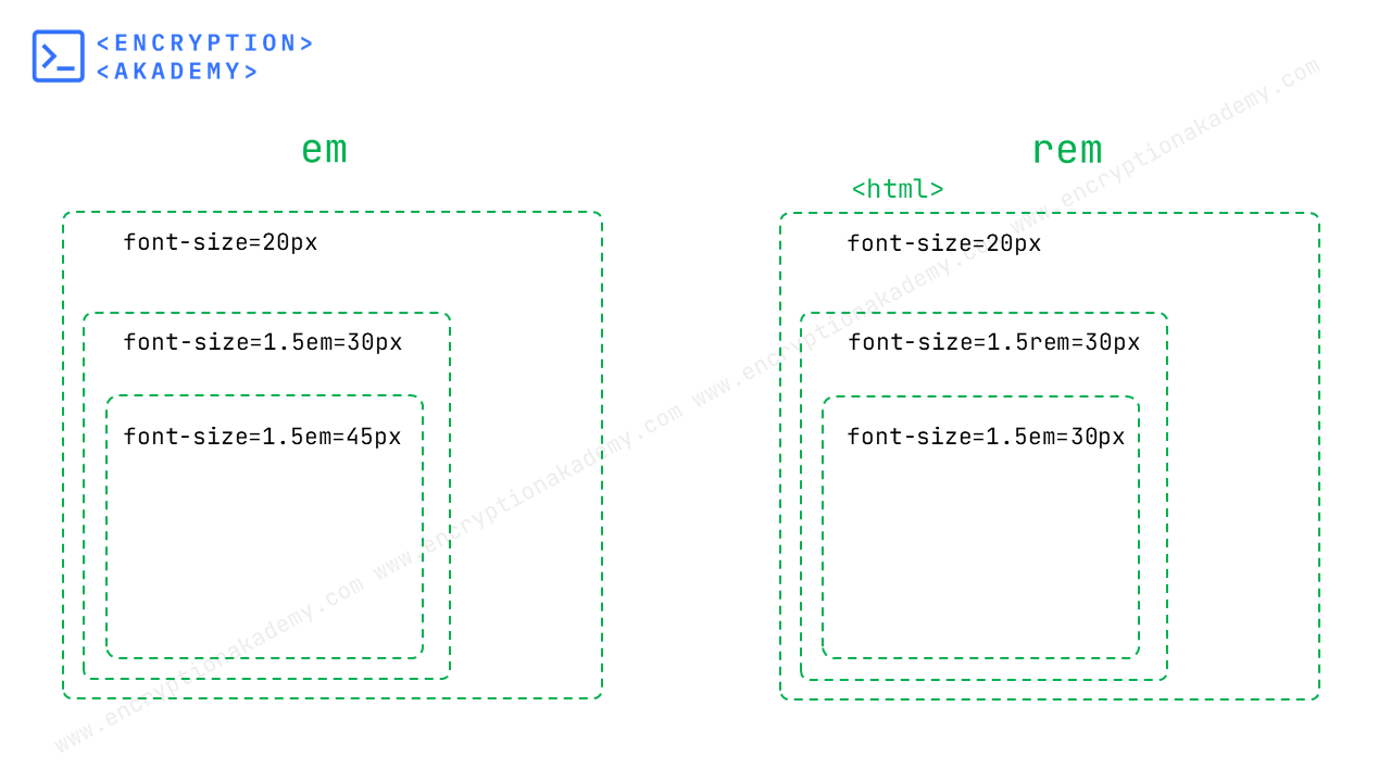
3. The rem Unit
The rem unit is relative to the font size of the webpage's root element (<html>). So 1rem is equal to the font-size value of root element.
This unit brings consistency in design. It overcomes the compounding effect caused by nested elements because its value is not effected by parent elements. In case the font-size of root element is not set, it is equal to default font-size provided by Browser and is generally 16px.
Example:
<div style="font-size: 30px;">
 <p style="font-size: 1em;">
  I am text with font-size 1em.
 </p>
 <p style="font-size: 1rem;">
  I am text with font-size 1rem.
 </p>

</div>
I am text with font-size 1em.
I am text with font-size 1rem.
4. The ex Unit
The CSS ex unit is based on the height of lowercase letter "x" in the font used. The size of letter x is different in each font. So if two paragraphs use different fonts, then the value of ex can be different for each paragraph. Hence it is rarely used.

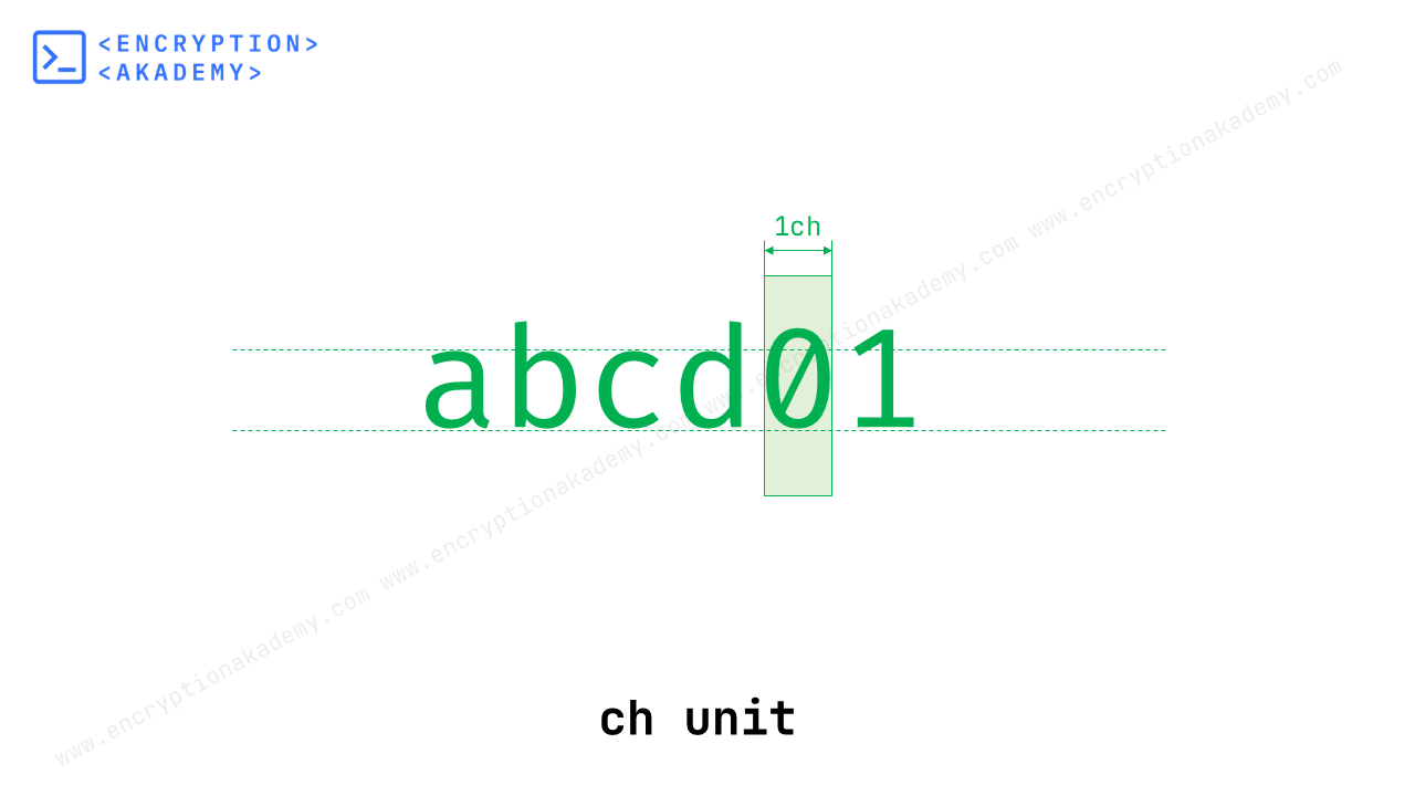
5. The ch Unit
The ch unit also known as character Unit, is based on width of character 0(zero) of the font used. So 1ch is equal to width of character 0.
For a monospace font like "Courier" all the characters are exaclty 1ch in width. But for majority other fonts which are proportional in nature, a character may be smaller or bigger than 0.
Line Height Units
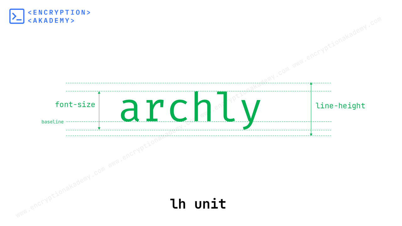
6. The lh Unit
The lh unit is based on line-height of current element that it is being applied to. Browser assigns every line an box with text vertically centered in it. So 1lh equals this line height as shown in figure below.
7. The rlh Unit
The rlh unit is based on line-height of root element (<html>) of the webpage.
Resolution Based Units
A resolution is used to specify the pixel density of the output device. In CSS there are units based on resolution which are listed below.
- Dots per inch - dpi
- Dots per centimeter - dpcm
- Dots per pixel unit - dppx
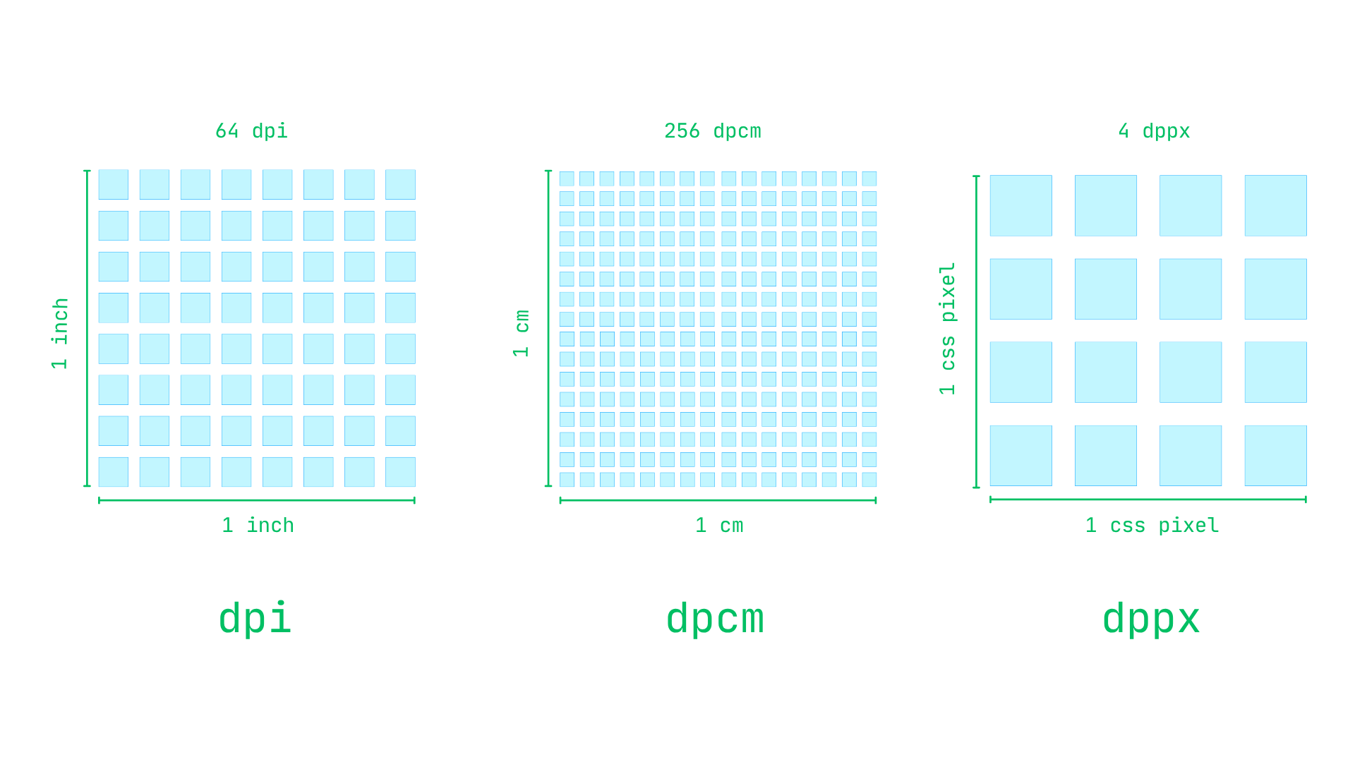
1. Dots per inch - dpi
dpi stands for dots per inch. This dot represents dots on paper for printed documents, pixel for desktop or mobile devices.
2. Dots per centimeter - dpcm
dpcm stands for dots per centimeter. It is same as dpi except centimeter is used in place of inch.
3. Dots per pixel unit - dppx
dppx stands for dots per pixel unit. In simple words it is a CSS unit that tells how many real screen pixels fit into one CSS pixel. Think of it like this:
- 1 dppx = 1 screen pixel for every CSS pixel → normal screen
- 2 dppx = 2 screen pixels for every CSS pixel → retina or high-resolution screen
- 3 dppx = 3 screen pixels for every CSS pixel → ultra high-resolution screen
x is alias for dppx
Time Units
In CSS Time Units are used to define durations for transitions, animations, delays, etc. CSS provides two main time units:
- seconds - s
- milliseconds - ms
1. seconds - s
s stands for seconds, the base unit of time in CSS for animations and transitions. Typically used for longer durations, like animations or loading sequences.
Example:
div {
  animation: fadeIn 2s ease-in;
}
2. milliseconds - ms
ms stands for milliseconds (1/1000 of a second). Best for faster or subtle effects where even a small delay matters. The common use cases are listed below.
- Quick hover or focus effects
- Button presses
- Tooltip appearances
- Micro-interactions (e.g., toggles, checkboxes)
button {
  transition: background-color 150ms ease;
}
Angle Units
CSS angle units are used to represent rotations, directions, and gradients. They are most commonly use them in: transform: rotate(), conic-gradient(), linear-gradient() (angle direction), @keyframes (e.g., rotating elements). The Angle Units available in CSS are listed below.
- degrees - deg
- gradians - grad
- radians - rad
- turns - turn
1. degrees - deg
It is the most common and human-readable unit. 1 full rotation is euqal to 360°.
Example:
transform: rotate(90deg);     /* quarter turn */
transform: rotate(-45deg);    /* counter-clockwise */
2. gradians - grad
Gradians were designed to make angular measurements more
decimal-friendly, with 100 gradians in a right angle instead of 90 degrees. This makes
calculations easier in some surveying and engineering applications.
Key conversions:
- 400 gradians = 360 degrees (full circle)
- 200 gradians = 180 degrees (straight angle)
- 100 gradians = 90 degrees (right angle)
- 1 gradian = 0.9 degrees
This unit is used in engineering, surveying, scientific applications. It is rarely used in web design but supported.
Example:
transform: rotate(100grad); /* 90 degrees */
3. radians - rad
Radian is a unit of angular measurement, based on the radius of a circle rather than arbitrary divisions.
One radian is the angle you get when you take the radius of a circle and wrap it around the circumference. Since the circumference of a circle is 2π times the radius, a full circle contains exactly 2π radians.
.jpg)
To convert between them:
Degrees to radians: multiply by π/180
Radians to degrees: multiply by 180/π
Key conversions:
- 360° = 2π radians
- 180° = π radians
- 90° = π/2 radians
- 60° = π/3 radians
- 45° = π/4 radians
- 30° = π/6 radians
transform: rotate(1.57rad); /* ~90 degrees */
4. turns - turn
The turns unit represents an angle in a number of turns. One full circle is equal to 1turn. This unit makes easy to express half or quarter turns.
Example:
transform: rotate(1turn);     /* full rotation */
transform: rotate(0.25turn);  /* 90 degrees */
Frequently Asked Questions (FAQ)
What is the difference between px, em, and rem units in CSS?
em is a relative unit based on the font-size of the current element's parent. If a parent has font-size: 20px, then 1em equals 20px in that context. This creates a compounding effect - if you nest elements with em values, they multiply. For instance, if a parent has font-size: 1.2em and its child also has font-size: 1.2em, the child's actual size becomes 1.44 times the grandparent's font size.
rem (root em) is relative to the root element's font-size, typically the <html> element. This avoids the compounding issue of em units. If the root font-size is 16px, then 1rem always equals 16px throughout the document, regardless of nesting.
What is the difference between Width:100% and width:100vw?
Sets the element’s width to 100% of its parent element’s width. It should be used when you want the element to fill its parent's width.
width: 100vw
Sets the element’s width to 100% of the viewport width, regardless of its parent. It is relative to the browser window. It should be used when you want the element to span the entire browser width, including beyond its container.
How to scale Font based on size of container?
.container {
  font-size: 2em; /* 2 × parent’s font-size */
}
2. Use vw or vmin Units The Font size adapts to viewport, not the container directly:
.responsive-text {
  font-size: 5vw; /* 5% of viewport width */
}
3. Use clamp() for Responsive Font Size The clamp(min, preferred, max) function allows you to control scaling with limits:
h1 {
  font-size: clamp(1rem, 5vw, 3rem);
}
4. Use media queries If you want the font to scale based on the size of its container, use media queries :
@container (min-width: 300px) {
  p{
    font-size: 1.5rem;
  }
}

@container (min-width: 400px) {
  p{
    font-size: 2rem;
  }
}
What Exactly Is Device Pixel Ratio (DPR)?
DPR = physical pixels / CSS pixels
For example,
if Your screen has 2 physical pixels for every 1 CSS pixel Then the DPR = 2
Which CSS unit is best for responsive design?
| Purpose | Recommended Units |
|---|---|
| Typography | rem, clamp() |
| Layout width | %, vw, fr |
| Layout height | vh, dvh |
| Spacing | rem, em, % |
What is the default unit in CSS?
1. Some properties allow you to omit the unit, and the value is treated as a number, not a length. Example: line-height, z-index, opacity, flex-grow, font-weight.
2. Some properties Require Units (No Default!). If you write width: 100; Browsers will ignore these values. You must specify a valid CSS unit such as px, %, em, etc.
What Is the Smallest Unit in CSS?
Example: On a Retina display: 1 CSS px = 2×2 physical pixels
What is the difference between rem and em?
em - The em unit is relative to the font size of its closest parent element. This means its computed value can vary depending on the element's location in the DOM hierarchy. For example, if a parent container has a font size of 20 pixels and a child element uses 1.5em, that child element will render at 30 pixels. One important caveat with em is that it can compound when nested, potentially leading to unexpected results if not carefully managed.
In general, rem is preferred for maintaining consistent typography and spacing across a site because it's unaffected by local context. em is better suited for making elements scale in relation to their container, such as adjusting padding or button size proportionally to local text. Understanding when to use each helps in building responsive, accessible, and scalable CSS layouts.