 Published: 29 May
2025
Published: 29 May
2025 5-min read


Table of Contents
INTRODUCTION
Viewport represents the visible area of screen. In the browser, it refers to the part of browser window where the web content is displayed. The viewport attribute of HTML <meta> tag defines the size and scale of viewport. It is the first step towards responsive web design.
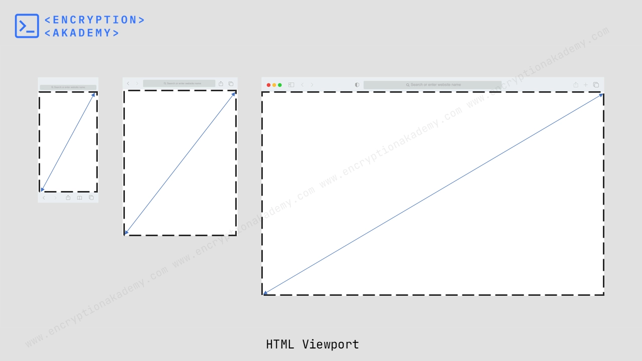
viewport
UI elements such as the address bar, toolbar, and scrollbars are not included in the viewport’s dimensions. These elements belong to the browser’s interface and are separate from the actual web page content.
Viewport in Meta Tag
The viewport meta tag is a crucial part of modern web development, especially for creating responsive web designs that look good on various devices (like desktops, tablets, and mobile phones). It helps control the layout and scaling of your webpage in the user's browser. The content attribute defines the various size options available for viewport. The various possible options available in this tag are listed below.
- width
- initial-scale
- height
- maximum-scale
- minimum-scale
- user-scalable
- interactive-widget
<meta name="viewport" content="width=device-width, initial-scale=1.0" >
a. width
The width property in the viewport tag controls the width of the viewport (the visible area of a web page on a screen). It allows developers to specify how the page should be scaled on different devices.
This attribute defines the size of viewport's width in pixels. Its value can be a positive integer or the keyword device-width.
- device-width - Sets the viewport width to the width of the device's screen in CSS pixels. This is the most common and recommended value for responsive design. This keyword works with all the different screen sizes.
- A positive integer - You can set a specific width (in pixels), but this is rarely recommended for modern responsive design.
Example:This will make the viewport always 1024 pixels wide, regardless of the device.
<meta name="viewport" content="width=1024" >
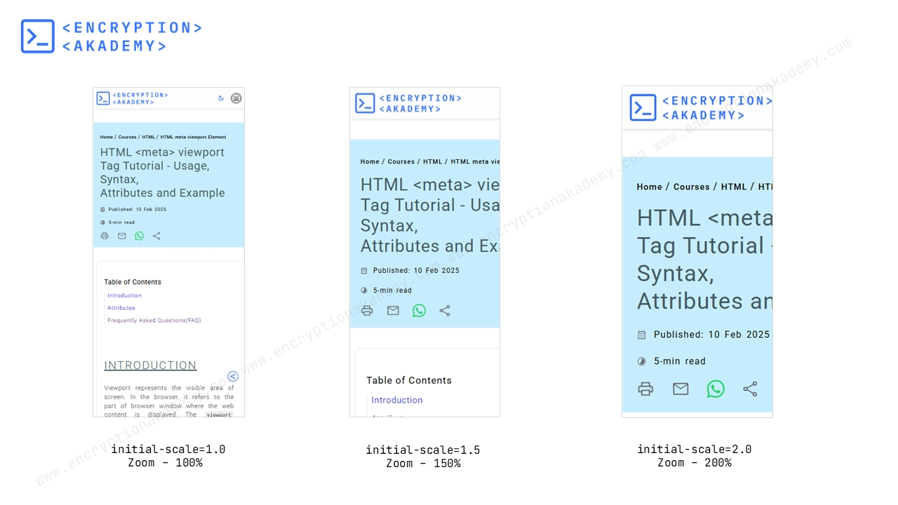
b. initial-scale
The initial-scale property specifies the level of initial zoom when a page is first loaded. It can take any value between 0.0 to 10. The default value is 1. The figure below depicts its effect at various zoom levels.
viewport-initial-scale
- 1.0 - It means no zoom, Normal layout (100% zoom level). Best for responsive pages. 50% Zoomed out. . 2.0 200% Zoomed in. Page appears larger.
- 0.5 - It means 50% zoom out and is half the normal size. Page appears smaller
- 2.0 - It means 200% Zoomed in and is twice the normal size. Page appears larger.
- Negative values are ignored.
c. height
This property defines the size of viewport's height in pixels. However, its almost never used in modern responsive design because: Most devices handle height dynamically based on the content and screen orientation.
Its value can be a positive integer or the text device-height.
d. maximum-scale
The maximum-scale property specifies the maximum level user can pinch-to-zoom on a webpage in a mobile browser. User cannot zoom beyond the maximum-scale level. It must be greater than or equal to minimum-scale.
- Its Minimum value is 0.1.
- Its Maximum value is 10.
- Its Default value is 10
- Negative values are ignored
Example:The user can zoom in up to 2x (200%). They cannot zoom in beyond 2x.
<meta name="viewport" content="width=1024, maximum-scale=2.0" >
e. minimum-scale
The minimum-scale property sets the lowest zoom level that a user can zoom out to when using a touch device. User cannot zoom below the minimum-scale level. It must be smaller than or equal to maximum-scale.
- Its Minimum value is 0.1.
- Its Maximum value is 10.
- Its Default value is 0.1
- Negative values are ignored.
Example:The user can zoom out to 50%
<meta name="viewport" content="width=1024, minimum-scale=0.5" >
f. user-scalable
The user-scalable controls whether users can manually zoom (pinch-to-zoom or double-tap) or not on a page in a touch device. It specifies whether the user can zoom the webpage or not. The allowed values are yes or no.
- yes - Users can zoom(default).
- no - Users cannot zoom.
Example:This disables the ability for users to zoom in or out.
<meta name="viewport" content="width=1024, user-scalable=no" >
g. interactive-widget
The interactive-widget property controls how browsers adjust the viewport size when an on-screen keyboard or other interactive widgets appear (like virtual keyboards on mobile devices).
When you focus on an input field (like a search box), the on-screen keyboard may appear and either: Resize the viewport (so the page shifts up and no content is hidden), or overlay on top of the content (so the page stays the same, but the keyboard overlaps). interactive-widget lets you control which behavior happens.
- resizes-visual - The visual viewport gets resized by the interactive widget(like keyboaord).
- resizes-content - The viewport gets resized.
- overlays-content - Neither the viewport nor the visual viewport gets resized while the interactive-widget overlays content.
Frequently Asked Questions (FAQ)
What is the Viewport in HTML?
In simple terms: The viewport = The part of the page you can see without scrolling.
Different devices have different viewport sizes:
- A desktop browser has a wide viewport
- A smartphone has a much narrower viewport
What is the difference between the viewport and screen size?
| Feature | Viewport | Screen Size |
|---|---|---|
| Definition | The visible area of a webpage within the browser window | The physical size of a device’s screen |
| Measurement | CSS pixels | Device pixels (hardware pixels) |
| Controlled by | <meta name="viewport"> tag in HTML | Device hardware (fixed) |
| Affects | How your website appears and scales on different devices | The total number of pixels available on the device |
| Example | Viewport width: 375px on iPhone 12 | Screen resolution: 1170×2532 pixels on iPhone 12 |
What is the purpose of this <meta name="viewport" content="width=device-width, initial-scale=1.0"> HTML tag?
- width=device-width - Sets the viewport width to match the device’s screen width in CSS pixels. This means your page will fit the screen size exactly, without zooming out.
- initial-scale=1.0 - Sets the initial zoom level when the page first loads. A scale of 1.0 means no zoom—the page appears at its normal size.
Is the <meta name="viewport"> tag really necessary?
| Scenario | With <meta name="viewport"> | Without <meta name="viewport"> |
|---|---|---|
| Layout on Mobile | Responsive; adjusts to screen size | Zoomed out; content appears small |
| Text Size | Readable, properly scaled | Very small, may require zoom |
| Images & Elements | Fit the screen width | Overflow screen, may cause horizontal scroll |
| User Experience | Mobile-friendly, responsive | Poor; user needs to zoom and scroll |
| When to Use | Always, for responsive design | Rarely (desktop-only sites) |